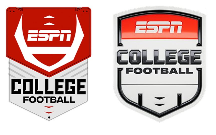
Excitement and debate are swirling in the college football and sports logo community as ESPN has pulled back the curtain on a brand-new logo for “ESPN College Football.”
The reveal comes just ahead of the 2025 season, sparking a wave of reactions across social media. Let’s look at the new logo and what fans are buzzing about.

College Football Logo: A Fresh Identity for a New Era
ESPN has announced its new College Football logo, officially launching a dramatic change in the sport’s branding on its network.
The new logo is part of an overall redesign that includes a refreshed graphics package and on-air presentation for the new season for the college football product.
View this post on Instagram
Designed by the creative agency Loyalkaspar, the logo and its accompanying visual system aim to modernize ESPN’s college football broadcasts while maintaining a strong connection to the sport’s traditions.
The redesigns offer a distinct look with a brighter, more dynamic aesthetic from the previous years no longer adhering to darker, cinematic colors to one as a celebration of the energy and spectacle which is college football.
The design team at ESPN paid attention to the logo system’s flexibility and adaptability for use in a variety of shows, marketing materials, and digital formats. The new visual identity will debut with the 2025 season and will give fans a new overall visual experience.
Fans React to ESPN’s New “College Football” Logo
As soon as the new logo was unveiled, fans took to social media to share their thoughts-ranging from enthusiastic praise to pointed criticism
Many fans welcomed the change, praising ESPN for embracing a modern look.
“The new graphics really bring out the energy of college football. It’s a great update for the new era,” one commented.
Others, though, weren’t pleased with how the logos have evolved. “Top Left was perfect,” one fan wrote, referencing the logo from the late 2000s.
Users took to Instagram with memes, joking that the new logo just doesn’t fit and wishing for the return of the old one. Their playful posts highlight just how much they miss the classic design.
RELATED: Oldest Logos in College Football: Clemson Tigers, Nebraska Cornhuskers, and More
The redesign did not suit everybody. Some fans were nostalgic for the old logo and graphics, with one user saying, “Bring back the O.G. one”. Another said, “Minimalism ruins everything it touches”. Even a few questioned the necessity of having change, whereas others said, “Why fix what wasn’t broken?”.
Many fans offered more nuanced takes, acknowledging both the positives and the drawbacks.
One user remarked, “It’s a bold move. I’ll have to see it in action before I decide if I like it.” Another shared, “I appreciate the effort to update things, but it’s going to take some getting used to.” Some fans expressed curiosity, saying, “I’m Interested to see how it looks during the big games—it could be a grower.”
One thing that ESPN’s new College Football logo has obviously achieved is getting fans talking. Regardless of the excitement or skepticism, the redesign is a brave step for the network’s college football coverage. The world is watching when this new identity forms the viewing experience as we enter the 2025 season.
College Sports Network has you covered with the latest news, analysis, insights, and trending stories in college football, men’s college basketball, women’s college basketball, and college baseball!

